Collaborate with and be kind to others. You are expected to work together as a group.
Ask questions. Remember that we won’t discuss these exercises as a class.
Activity Specific
Help each other with the following:
Create a new Quarto document in the activities folder of your portfolio project and do not forgot to include it in _quarto.yml file. Then click the </> Code link at the top right corner of this page and copy the code into the created Quarto document. This is where you’ll take notes. Remember that the portfolio is yours, so take notes in whatever way is best for you.
Don’t start the Exercises section before we get there as a class. First, engage in class discussion and eventually collaborate with your group on the exercises!
12.1 Warm-up
Where are we? Data preparation
Thus far, we’ve learned how to:
do some wrangling:
arrange() our data in a meaningful order
subset the data to only filter() the rows and select() the columns of interest
mutate() existing variables and define new variables
summarize() various aspects of a variable, both overall and by group (group_by())
reshape our data to fit the task at hand (pivot_longer(), pivot_wider())
join() different datasets into one
What next?
In the remaining days of our data preparation unit, we’ll focus on working with special types of “categorical” variables: characters and factors. Variables with these structures often require special tools and considerations.
We’ll focus on two common considerations:
Regular expressions
When working with character strings, we might want to detect, replace, or extract certain patterns. For example, recall our data on courses:
Focusing on just the sem character variable, we might want to…
- change `FA` to `fall_` and `SP` to `spring_`
- keep only courses taught in fall
- split the variable into 2 new variables: `semester` (`FA` or `SP`) and `year`
Converting characters to factors (and factors to meaningful factors) (today)
When categorical information is stored as a character variable, the categories of interest might not be labeled or ordered in a meaningful way. We can fix that!
EXAMPLE 1
Recall our data on presidential election outcomes in each U.S. county (except those in Alaska):
  state_abbr historical    county_name total_votes_20 repub_pct_20 dem_pct_20
1         AL        red Autauga County          27770        71.44      27.02
2         AL        red Baldwin County         109679        76.17      22.41
3         AL        red Barbour County          10518        53.45      45.79
4         AL        red    Bibb County           9595        78.43      20.70
5         AL        red  Blount County          27588        89.57       9.57
6         AL        red Bullock County           4613        24.84      74.70
  dem_support_20
1            low
2            low
3            low
4            low
5            low
6           high
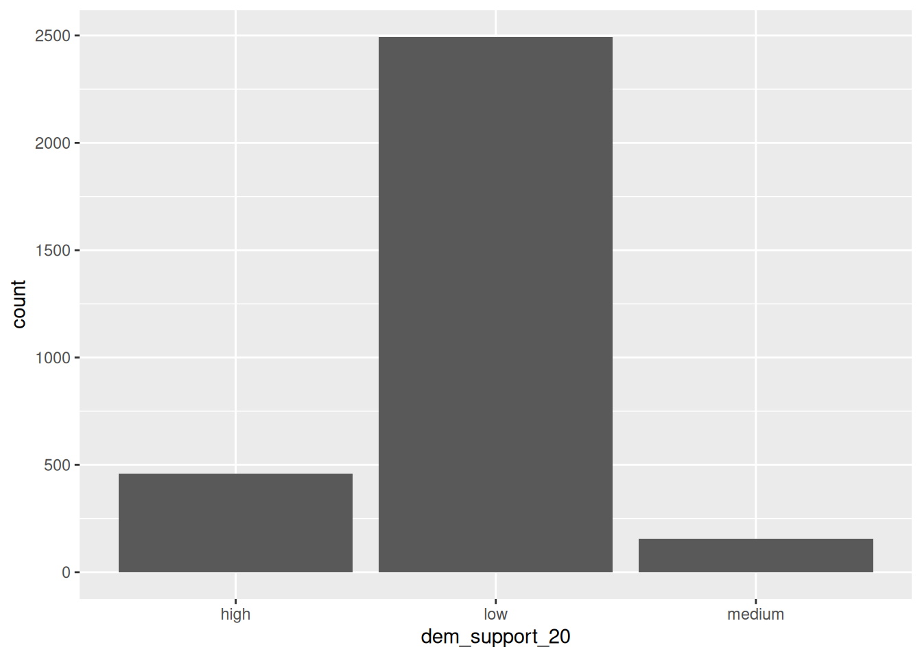
Check out the below visual and numerical summaries of dem_support_20:
low = the Republican won the county by at least 5 percentage points
medium = the Republican and Democrat votes were within 5 percentage points
high = the Democrat won the county by at least 5 percentage points
  dem_support_20    n
1           high  458
2            low 2494
3         medium  157
Follow-up:
What don’t you like about these results?
EXAMPLE 2: Creating factor variables with meaningfully ordered levels (fct_relevel)
The above categories of dem_support_20 are listed alphabetically, which isn’t particularly meaningful here. This is because dem_support_20 is a character variable and R thinks of character strings as words, not category labels with any meaningful order (other than alphabetical):
str(elections)
'data.frame':   3109 obs. of  7 variables:
 $ state_abbr    : chr  "AL" "AL" "AL" "AL" ...
 $ historical    : chr  "red" "red" "red" "red" ...
 $ county_name   : chr  "Autauga County" "Baldwin County" "Barbour County" "Bibb County" ...
 $ total_votes_20: int  27770 109679 10518 9595 27588 4613 9488 50983 15284 12301 ...
 $ repub_pct_20  : num  71.4 76.2 53.5 78.4 89.6 ...
 $ dem_pct_20    : num  27.02 22.41 45.79 20.7 9.57 ...
 $ dem_support_20: chr  "low" "low" "low" "low" ...
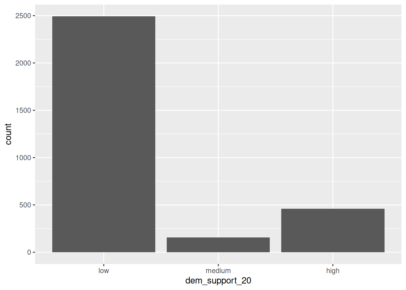
We can fix this by using fct_relevel() to both:
Store dem_support_20 as a factor variable, the levels of which are recognized as specific levels or categories, not just words.
Specify a meaningful order for the levels of the factor variable.
# Notice that the order of the levels is not alphabetical!elections <- elections |>mutate(dem_support_20 =fct_relevel(dem_support_20, c("low", "medium", "high")))# Notice the new structure of the dem_support_20 variablestr(elections)
# And plot dem_support_20ggplot(elections, aes(x = dem_support_20)) +geom_bar()
EXAMPLE 3: Changing the labels of the levels in factor variables
We now have a factor variable, dem_support_20, with categories that are ordered in a meaningful way:
elections |>count(dem_support_20)
  dem_support_20    n
1            low 2494
2         medium  157
3           high  458
But maybe we want to change up the category labels. For demo purposes, let’s create a new factor variable, results_20, that’s the same as dem_support_20 but with different category labels:
# We can redefine any number of the category labels.# Here we'll relabel all 3 categories:elections <- elections |>mutate(results_20 =fct_recode(dem_support_20, "strong republican"="low","close race"="medium","strong democrat"="high"))# Check it out# Note that the new category labels are still in a meaningful,# not necessarily alphabetical, order!elections |>count(results_20)
         results_20    n
1 strong republican 2494
2        close race  157
3   strong democrat  458
EXAMPLE 4: Re-ordering factor levels
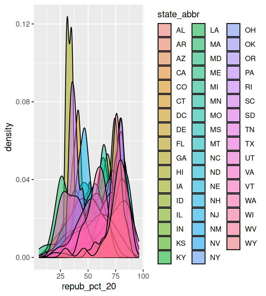
Finally, let’s explore how the Republican vote varied from county to county within each state:
# Note that we're just piping the data into ggplot instead of writing# it as the first argumentelections |>ggplot(aes(x = repub_pct_20, fill = state_abbr)) +geom_density(alpha =0.5)
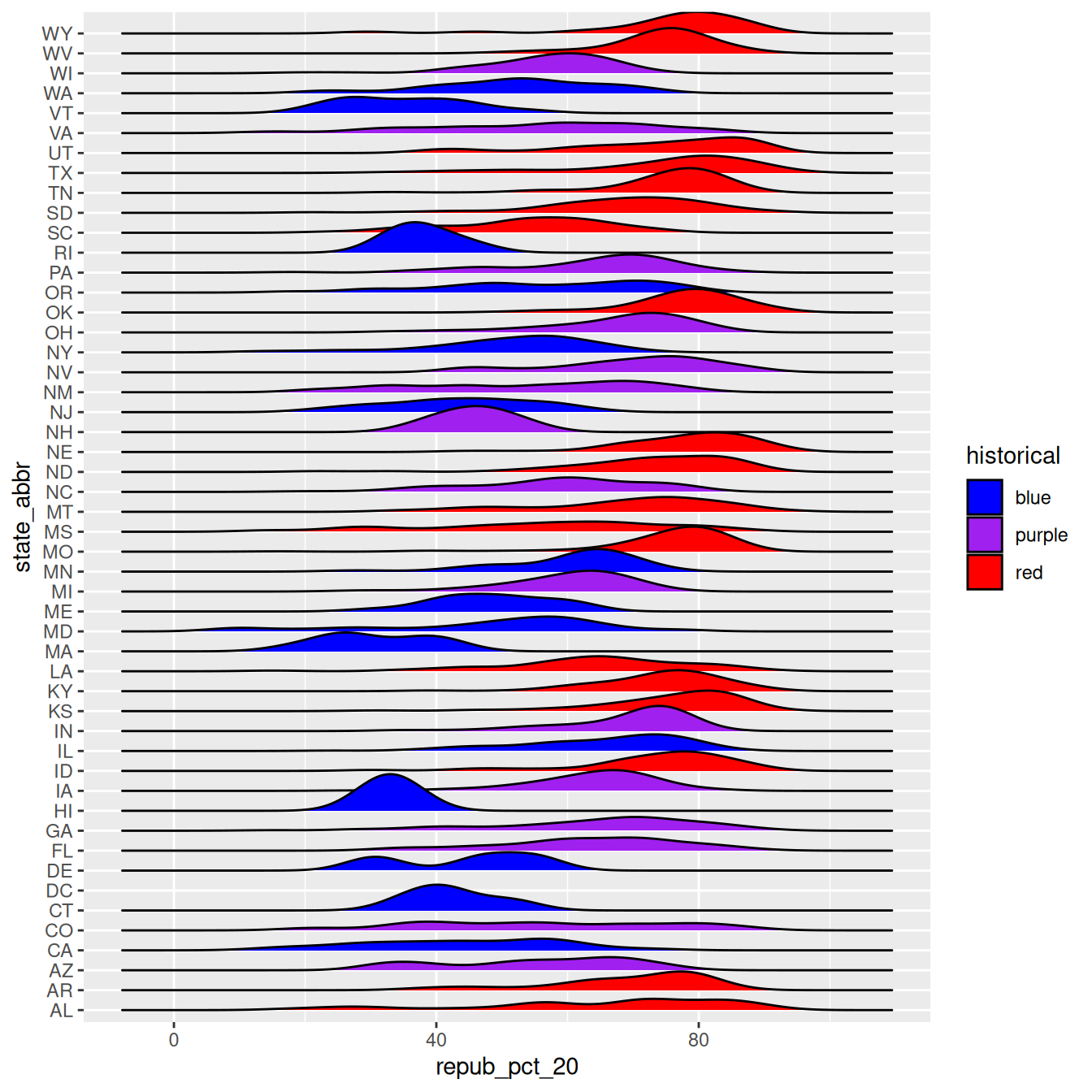
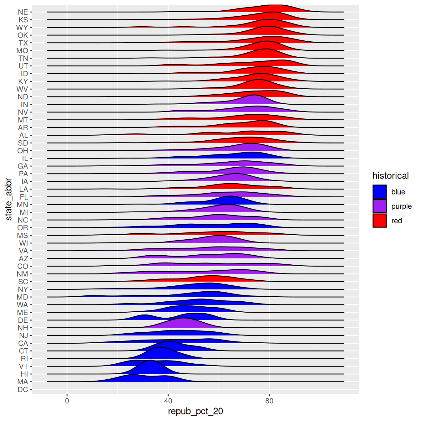
This is too many density plots to put on top of one another. Let’s spread these out while keeping them in the same frame, hence easier to compare, using a joy plot or ridge plot:
library(ggridges)elections |>ggplot(aes(x = repub_pct_20, y = state_abbr, fill = historical)) +geom_density_ridges() +scale_fill_manual(values =c("blue", "purple", "red"))
OK, but this is alphabetical. Suppose we want to reorder the states according to their typical Republican support. Recall that we did something similar in Example 2, using fct_relevel() to specify a meaningful order for the dem_support_20 categories:
We could use fct_relevel() to reorder the states here, but what would be the drawbacks?
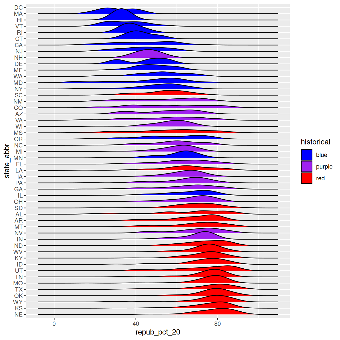
EXAMPLE 5: Re-ordering factor levels according to another variable
When a meaningful order for the categories of a factor variable can be defined by another variable in our dataset, we can use fct_reorder(). In our joy plot, let’s reorder the states according to their median Republican support:
# Since we might want states to be alphabetical in other parts of our analysis,# we'll pipe the data into the ggplot without storing it:elections |>mutate(state_abbr =fct_reorder(state_abbr, repub_pct_20, .fun ="median")) |>ggplot(aes(x = repub_pct_20, y = state_abbr, fill = historical)) +geom_density_ridges() +scale_fill_manual(values =c("blue", "purple", "red"))
# How did the code change?# And the corresponding output?elections |>mutate(state_abbr =fct_reorder(state_abbr, repub_pct_20, .fun ="median", .desc =TRUE)) |>ggplot(aes(x = repub_pct_20, y = state_abbr, fill = historical)) +geom_density_ridges() +scale_fill_manual(values =c("blue", "purple", "red"))
WORKING WITH FACTOR VARIABLES
The forcats package, part of the tidyverse, includes handy functions for working with categorical variables (for + cats):
Here are just some, some of which we explored above:
functions for changing the order of factor levels
fct_relevel() = manually reorder levels
fct_reorder() = reorder levels according to values of another variable
fct_infreq() = order levels from highest to lowest frequency
fct_rev() = reverse the current order
functions for changing the labels or values of factor levels
  grade    n
1     A 1506
2    A- 1381
3    AU   27
4     B  804
5    B+ 1003
6    B-  330
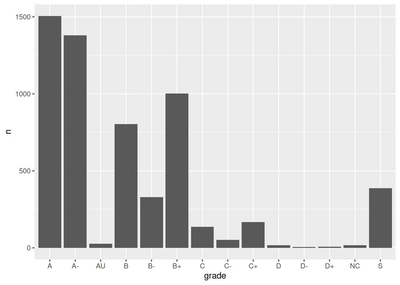
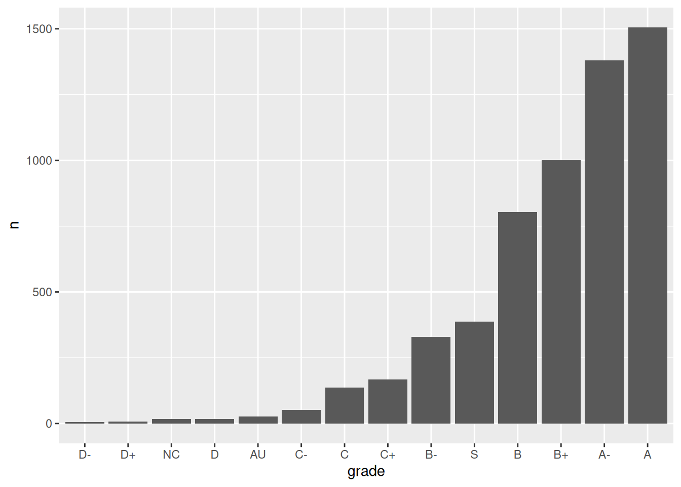
Exercise 1: Changing the order (option 1)
Check out a column plot of the number of times each grade was assigned during the study period. This is similar to a bar plot, but where we define the height of a bar according to variable in our dataset.
grade_distribution |>ggplot(aes(x = grade, y = n)) +geom_col()
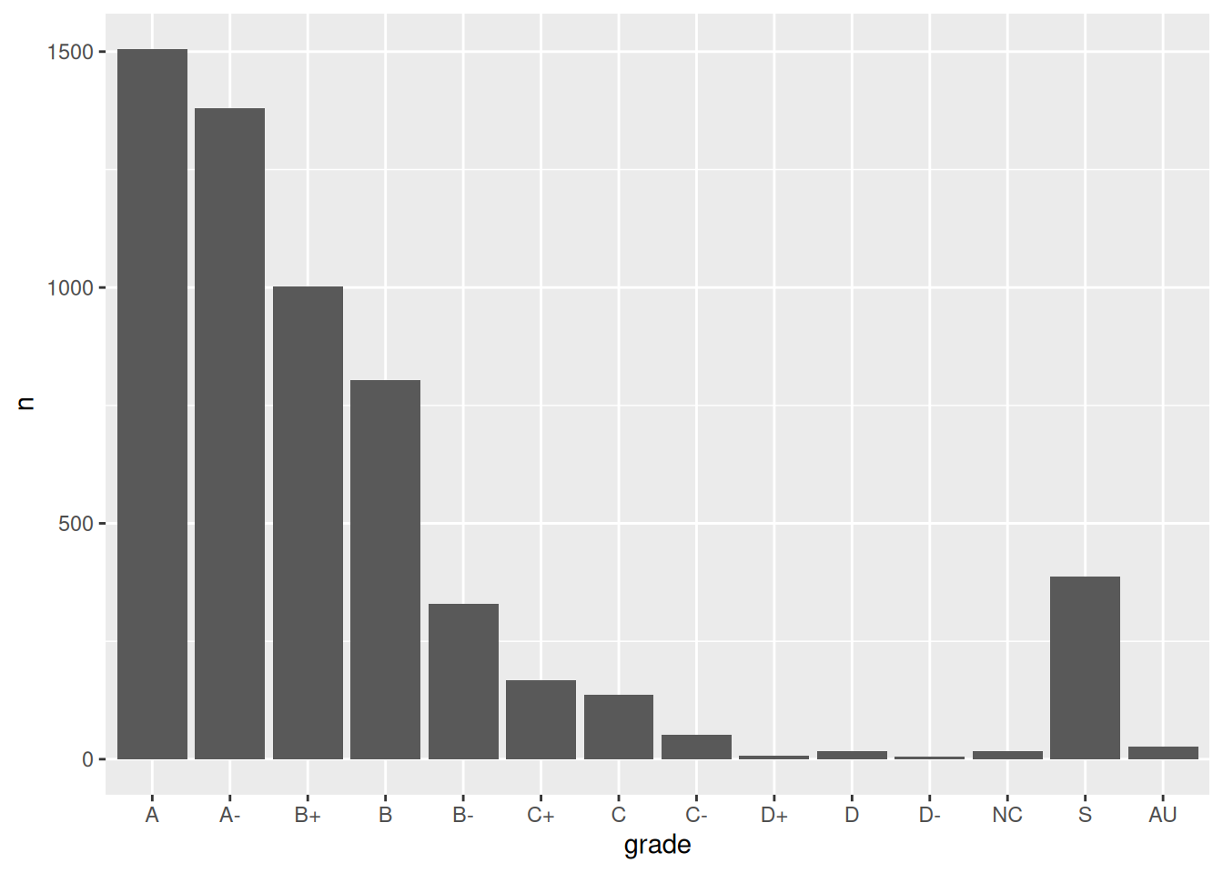
The order of the grades is goofy! Construct a new column plot, manually reordering the grades from high (A) to low (NC) with “S” and “AU” at the end:
It may not be clear what “AU” and “S” stand for. Construct a new column plot that renames these levels “Audit” and “Satisfactory”, while keeping the other grade labels the same and in a meaningful order:
# grade_distribution |># mutate(grade = ___(___, c("A", "A-", "B+", "B", "B-", "C+", "C", "C-", "D+", "D", "D-", "NC", "S", "AU"))) |># mutate(grade = ___(___, ___, ___)) |> # Multiple pieces go into the last 2 blanks# ggplot(aes(x = grade, y = n)) +# geom_col()
12.3 Solutions
Click for Solutions
EXAMPLE 1
The categories are in alphabetical order, which isn’t meaningful here.
EXAMPLE 4: Re-ordering factor levels
we would have to:
Calculate the typical Republican support in each state, e.g. using group_by() and summarize().
We’d then have to manually type out a meaningful order for 50 states! That’s a lot of typing and manual bookkeeping.
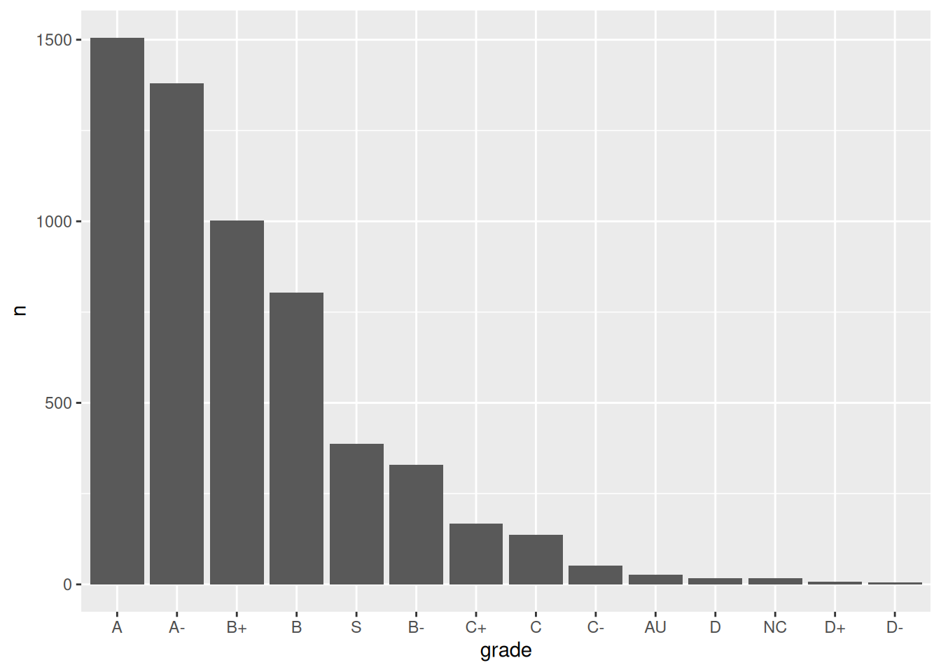
grade_distribution |>mutate(grade =fct_reorder(grade, n, .desc =TRUE)) |>ggplot(aes(x = grade, y = n)) +geom_col()
Exercise 2: Changing factor level labels
grade_distribution |>mutate(grade =fct_relevel(grade, c("A", "A-", "B+", "B", "B-", "C+", "C", "C-", "D+", "D", "D-", "NC", "S", "AU"))) |>mutate(grade =fct_recode(grade, "Satisfactory"="S", "Audit"="AU")) |># Multiple pieces go into the last 2 blanksggplot(aes(x = grade, y = n)) +geom_col()
Source Code
---title: "Factors"number-sections: trueexecute: warning: falsefig-env: 'figure'fig-pos: 'h'fig-align: centercode-fold: false---::: {.callout-caution title="Learning Goals"}- Understand the difference between `character` and `factor` variables.- Be able to convert a `character` variable to a `factor`.- Develop comfort in manipulating the order and values of a factor.:::::: {.callout-note title="Additional Resources"}For more information about the topics covered in this chapter, refer to the resources below:- [forcats cheat sheet (pdf)](https://github.com/rstudio/cheatsheets/raw/main/factors.pdf)- [Factors (html)](https://r4ds.hadley.nz/factors) by Wickham & Grolemund:::{{< include activity-instructions.qmd >}}## Warm-up**Where are we? Data preparation**Thus far, we've learned how to:- do some wrangling: - `arrange()` our data in a meaningful order - subset the data to only `filter()` the rows and `select()` the columns of interest - `mutate()` existing variables and define new variables - `summarize()` various aspects of a variable, both overall and by group (`group_by()`)- reshape our data to fit the task at hand (`pivot_longer()`, `pivot_wider()`)- `join()` different datasets into one\\\\**What next?**In the remaining days of our data preparation unit, we'll focus on working with special types of "categorical" variables: *characters* and *factors*. Variables with these structures often require special tools and considerations.We'll focus on two common considerations:1. **Regular expressions**\ When working with character strings, we might want to detect, replace, or extract certain patterns. For example, recall our data on `courses`:```{r echo = FALSE}courses <- read.csv("https://mac-stat.github.io/data/courses.csv")# Check out the datahead(courses)# Check out the structure of each variable# Many of these are characters!str(courses)```Focusing on just the `sem` character variable, we might want to...``` - change `FA` to `fall_` and `SP` to `spring_`- keep only courses taught in fall- split the variable into 2 new variables: `semester` (`FA` or `SP`) and `year````\2. **Converting characters to factors (and factors to meaningful factors)** (today)\ When categorical information is stored as a *character* variable, the categories of interest might not be labeled or ordered in a meaningful way. We can fix that!\\\\**EXAMPLE 1**Recall our data on presidential election outcomes in each U.S. county (except those in Alaska):```{r}library(tidyverse)elections <-read.csv("https://mac-stat.github.io/data/election_2020_county.csv") |>select(state_abbr, historical, county_name, total_votes_20, repub_pct_20, dem_pct_20) |>mutate(dem_support_20 =case_when( (repub_pct_20 - dem_pct_20 >=5) ~"low", (repub_pct_20 - dem_pct_20 <=-5) ~"high",.default ="medium" ))# Check it outhead(elections) ```Check out the below visual and numerical summaries of `dem_support_20`:- low = the Republican won the county by at least 5 percentage points- medium = the Republican and Democrat votes were within 5 percentage points- high = the Democrat won the county by at least 5 percentage points```{r}ggplot(elections, aes(x = dem_support_20)) +geom_bar()elections |>count(dem_support_20)```Follow-up:What don't you like about these results?\\\\**EXAMPLE 2: Creating factor variables with meaningfully ordered levels (fct_relevel)**The above categories of `dem_support_20` are listed alphabetically, which isn't particularly meaningful here. This is because `dem_support_20` is a *character* variable and R thinks of character strings as words, not category labels with any meaningful order (other than alphabetical):```{r}str(elections)```We can fix this by using `fct_relevel()` to both:(1) Store `dem_support_20` as a *factor* variable, the levels of which are recognized as specific **levels** or categories, not just words.(2) Specify a meaningful order for the levels of the factor variable.```{r}# Notice that the order of the levels is not alphabetical!elections <- elections |>mutate(dem_support_20 =fct_relevel(dem_support_20, c("low", "medium", "high")))# Notice the new structure of the dem_support_20 variablestr(elections)``````{r}# And plot dem_support_20ggplot(elections, aes(x = dem_support_20)) +geom_bar()```\\\\**EXAMPLE 3: Changing the labels of the levels in factor variables**We now have a *factor* variable, `dem_support_20`, with categories that are ordered in a meaningful way:```{r}elections |>count(dem_support_20)```But maybe we want to change up the category *labels*. For demo purposes, let's create a *new* factor variable, `results_20`, that's the same as `dem_support_20` but with different category labels:```{r}# We can redefine any number of the category labels.# Here we'll relabel all 3 categories:elections <- elections |>mutate(results_20 =fct_recode(dem_support_20, "strong republican"="low","close race"="medium","strong democrat"="high"))# Check it out# Note that the new category labels are still in a meaningful,# not necessarily alphabetical, order!elections |>count(results_20)```\\\\**EXAMPLE 4: Re-ordering factor levels**Finally, let's explore how the Republican vote varied from county to county within each state:```{r fig.width = 4.5}# Note that we're just piping the data into ggplot instead of writing# it as the first argumentelections |> ggplot(aes(x = repub_pct_20, fill = state_abbr)) + geom_density(alpha = 0.5)```This is too many density plots to put on top of one another. Let's spread these out while keeping them in the same frame, hence easier to compare, using a **joy plot** or **ridge plot**:```{r fig.height = 7}library(ggridges)elections |> ggplot(aes(x = repub_pct_20, y = state_abbr, fill = historical)) + geom_density_ridges() + scale_fill_manual(values = c("blue", "purple", "red"))```OK, but this is alphabetical. Suppose we want to reorder the states according to their typical Republican support. Recall that we did something similar in Example 2, using `fct_relevel()` to specify a meaningful order for the `dem_support_20` categories:`fct_relevel(dem_support_20, c("low", "medium", "high"))`We *could* use `fct_relevel()` to reorder the states here, but what would be the drawbacks?\\\\**EXAMPLE 5: Re-ordering factor levels according to another variable**When a meaningful order for the categories of a factor variable can be defined by *another* variable in our dataset, we can use `fct_reorder()`. In our joy plot, let's reorder the states according to their *median* Republican support:```{r fig.height = 7}# Since we might want states to be alphabetical in other parts of our analysis,# we'll pipe the data into the ggplot without storing it:elections |> mutate(state_abbr = fct_reorder(state_abbr, repub_pct_20, .fun = "median")) |> ggplot(aes(x = repub_pct_20, y = state_abbr, fill = historical)) + geom_density_ridges() + scale_fill_manual(values = c("blue", "purple", "red"))``````{r fig.height = 7}# How did the code change?# And the corresponding output?elections |> mutate(state_abbr = fct_reorder(state_abbr, repub_pct_20, .fun = "median", .desc = TRUE)) |> ggplot(aes(x = repub_pct_20, y = state_abbr, fill = historical)) + geom_density_ridges() + scale_fill_manual(values = c("blue", "purple", "red"))```\\\\**WORKING WITH FACTOR VARIABLES**The `forcats` package, part of the `tidyverse`, includes handy functions for working with categorical variables (`for` + `cats`):Here are just some, some of which we explored above:- functions for changing the **order** of factor levels - `fct_relevel()` = *manually* reorder levels - `fct_reorder()` = reorder levels according to values of another *variable* - `fct_infreq()` = order levels from highest to lowest frequency - `fct_rev()` = reverse the current order- functions for changing the **labels** or values of factor levels - `fct_recode()` = *manually* change levels - `fct_lump()` = *group together* least common levels\\\\## ExercisesThe exercises revisit our `grades` data:```{r echo = FALSE}# Get rid of some duplicate rows!grades <- read.csv("https://mac-stat.github.io/data/grades.csv") |> distinct(sid, sessionID, .keep_all = TRUE)# Check it outhead(grades)```We'll explore the number of times each grade was assigned:```{r}grade_distribution <- grades |>count(grade)head(grade_distribution)```### Exercise 1: Changing the order (option 1) {.unnumbered}Check out a **column plot** of the number of times each grade was assigned during the study period. This is similar to a bar plot, but where we define the height of a bar according to variable in our dataset.```{r}grade_distribution |>ggplot(aes(x = grade, y = n)) +geom_col()```The order of the grades is goofy! Construct a new column plot, manually reordering the grades from high (A) to low (NC) with "S" and "AU" at the end:```{r}# grade_distribution |># mutate(grade = ___(___, c("A", "A-", "B+", "B", "B-", "C+", "C", "C-", "D+", "D", "D-", "NC", "S", "AU"))) |># ggplot(aes(x = grade, y = n)) +# geom_col()```Construct a new column plot, reordering the grades in ascending frequency (i.e. how often the grades were assigned):```{r}# grade_distribution |># mutate(grade = ___(___, ___)) |># ggplot(aes(x = grade, y = n)) +# geom_col()```Construct a new column plot, reordering the grades in descending frequency (i.e. how often the grades were assigned):```{r}# grade_distribution |># mutate(grade = ___(___, ___, ___ = TRUE)) |># ggplot(aes(x = grade, y = n)) +# geom_col()```\\\\### Exercise 2: Changing factor level labels {.unnumbered}It may not be clear what "AU" and "S" stand for. Construct a new column plot that renames these levels "Audit" and "Satisfactory", while keeping the other grade labels the same *and* in a meaningful order:```{r}# grade_distribution |># mutate(grade = ___(___, c("A", "A-", "B+", "B", "B-", "C+", "C", "C-", "D+", "D", "D-", "NC", "S", "AU"))) |># mutate(grade = ___(___, ___, ___)) |> # Multiple pieces go into the last 2 blanks# ggplot(aes(x = grade, y = n)) +# geom_col()```\\\\## Solutions<details><summary>Click for Solutions</summary>**EXAMPLE 1**The categories are in alphabetical order, which isn't meaningful here.\\\\**EXAMPLE 4: Re-ordering factor levels**we would have to:1. Calculate the typical Republican support in each state, e.g. using `group_by()` and `summarize()`.2. We'd then have to manually type out a meaningful order for 50 states! That's a lot of typing and manual bookkeeping.\\\\### Exercise 1: Changing the order {.unnumbered}```{r}grade_distribution |>mutate(grade =fct_relevel(grade, c("A", "A-", "B+", "B", "B-", "C+", "C", "C-", "D+", "D", "D-", "NC", "S", "AU"))) |>ggplot(aes(x = grade, y = n)) +geom_col()``````{r}grade_distribution |>mutate(grade =fct_reorder(grade, n)) |>ggplot(aes(x = grade, y = n)) +geom_col()``````{r}grade_distribution |>mutate(grade =fct_reorder(grade, n, .desc =TRUE)) |>ggplot(aes(x = grade, y = n)) +geom_col()```\\\\### Exercise 2: Changing factor level labels {.unnumbered}```{r}grade_distribution |>mutate(grade =fct_relevel(grade, c("A", "A-", "B+", "B", "B-", "C+", "C", "C-", "D+", "D", "D-", "NC", "S", "AU"))) |>mutate(grade =fct_recode(grade, "Satisfactory"="S", "Audit"="AU")) |># Multiple pieces go into the last 2 blanksggplot(aes(x = grade, y = n)) +geom_col()```\\\\</details>